When users come to your website, they will start looking for information from the navigation menu. So that a good navigation menu will increase your website conversion rate and generate more revenue, otherwise, it will cause users to leave and look for your competitors.
Unfortunately, designers often ignore navigation menu design because they misperceive the navigation bar as nothing more than several text and links, it's not particularly noteworthy. But navigation menu design is far more than that.
In this article, I will introduce the best navigation practices, types of navigation bars, and the best navigation design examples in 2019 for your inspiration.
First things first:
Primary and secondary navigation
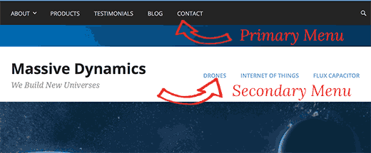
Large websites tend to have a lot of content and need to present more information. In this case, there is a need for primary and secondary navigation to share the complexity of the content found on the website.

Primary navigation
Primary navigation is the most important guide of the website, and it is also the easiest way to help users to find the information they need.
Primary navigation usually includes the most important infomation, such as "Features", "Price", “Download”, and so on. The primary navigation should be clear and easy to find in case that the user gets lost on your website. Primary navigation should help the user know where they are and what they can find.
Secondary navigation
Secondary navigation is the second user interesting content of the website.
In general, the secondary navigation of the website is often placed on the page accessed through the primary navigation. The user can easily go through these sub-categories to access the more info on the website.
What are the different types of website navigation?
Horizontal navigation menu
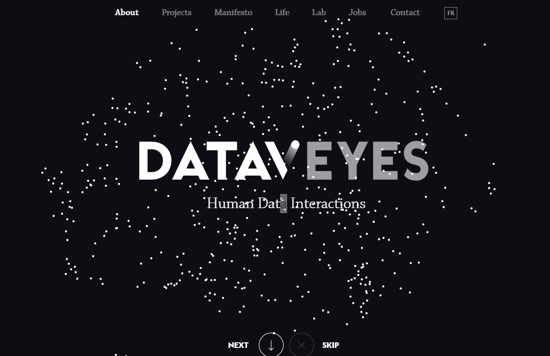
The horizontal navigation menu is widely used by thousands of websites and the most easily acceptable nagivation by users. The horizontal navigation menu design is conservative but purposeful, ensuring the reliability of the organizational structure and reducing the time cost for users to find the information they are seeking.

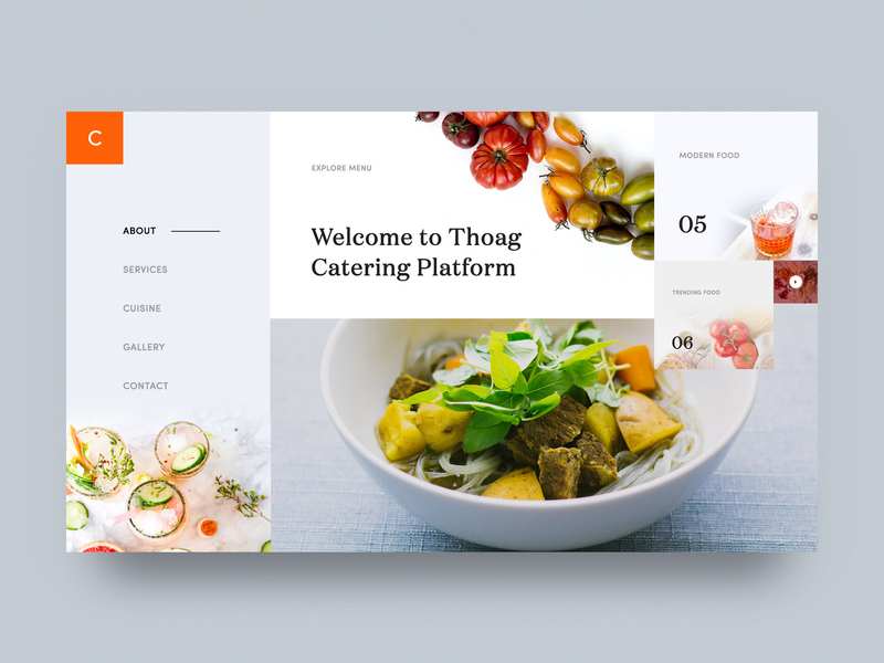
Vertical navigation menu
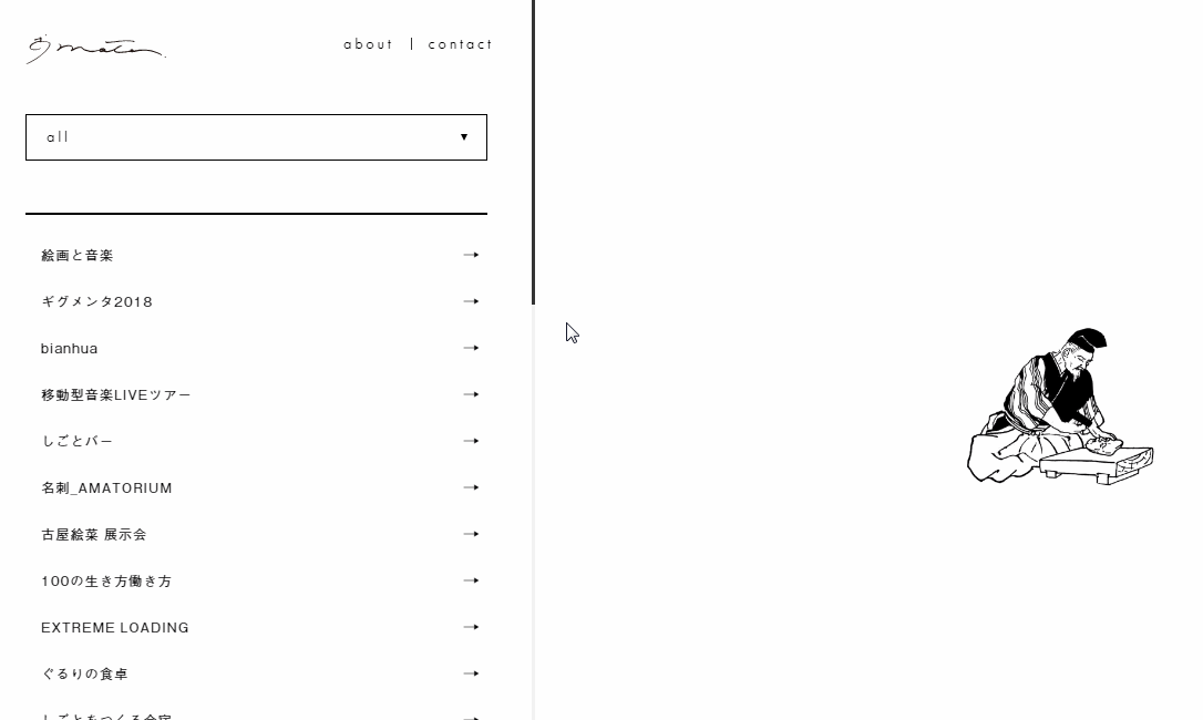
The vertical navigation menus is more personalized and stylish.

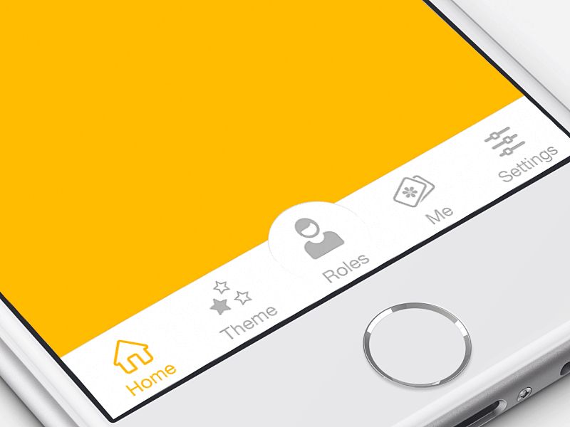
Bottom navigation bar
The bottom bar navigation is typically used in the mobile design.

Breadcrumbs
The role of breadcrumb navigation is to tell visitors where they currently are on the site and how to return to the homepage.
The most common way to show breadcrumbs is through horizontal text links separated by a ( ">"), which also implies their hierarchical relationship.

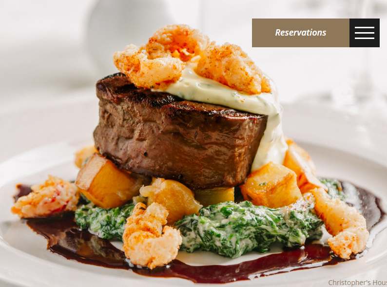
Hamburger navigation menu
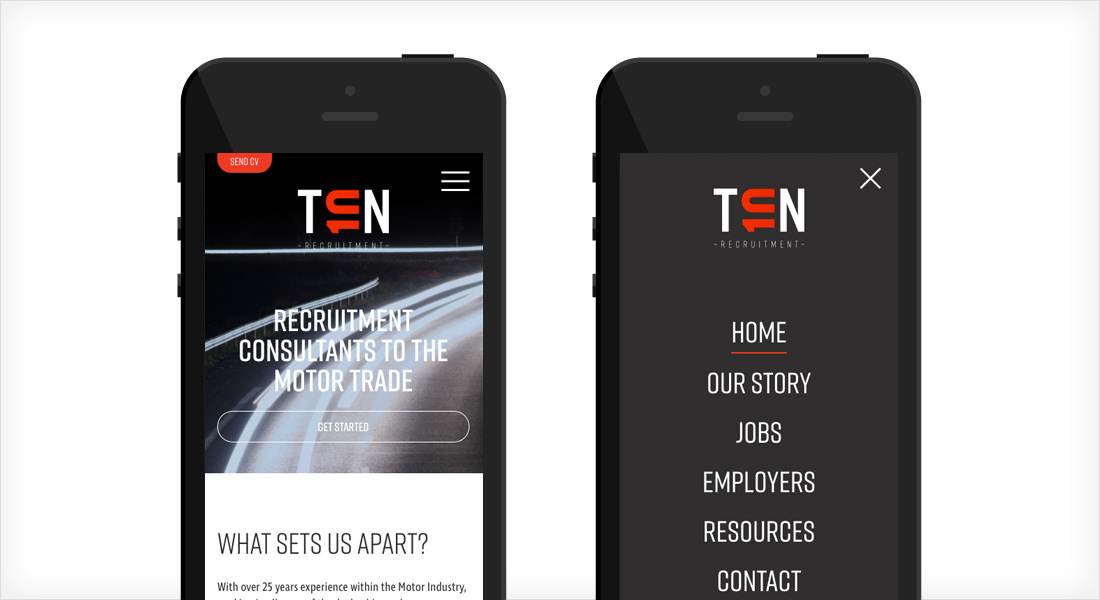
The hamburger navigation menu is presented by three horizontal lines and is a very common navigation bar design type. However, this article believes that the learning curve of Hamburg navigation is really high for users and the user experience is not good. Take a look: http://mor10.com/hamburger-bad/
But, since different websites have different needs, we can’t be 100% sure that we will meet all the user's needs, and the hamburger menu navigation still appears on thousands of websites.
Related: 22 Best Hamburger Menu Examples for Mobile Apps and Websites

Drop down navigation menu
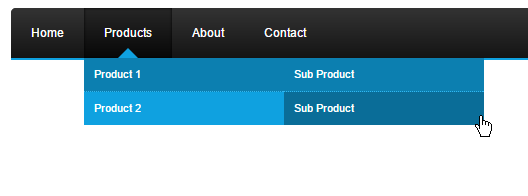
The drop-down navigation menu is usually called a drop-down menu, which is a very common navigation.

Related article: How to Make a Mouse Hover Drop Down Menu with Mockplus?
Mega Menus
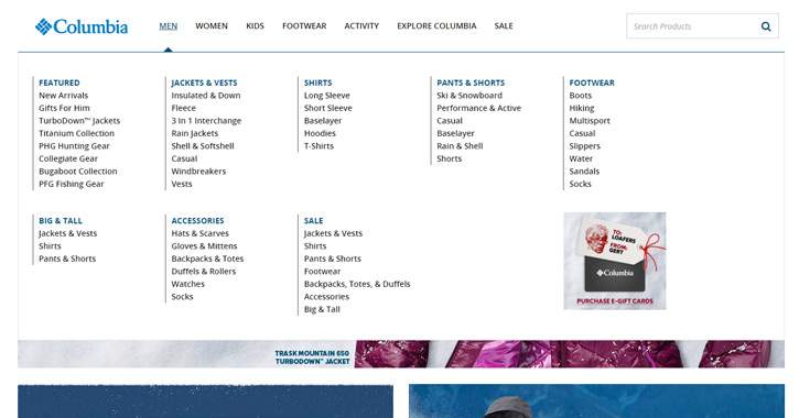
Mega Menu is popular in magazines and blog sites. They differ from the drop-down menu because it allows for a wider vertical drop-down menu. It contains multiple categories of content, and these super-menus expand wider.
Related: 10 Best Mega Menu Examples for Reference in 2019

Responsive card grid navigation

Related article: 20 Best Free Responsive HTML5 Web Templates in 2018
Related article: 8 Best Free Responsive CSS Website Templates for Building Your Website
Scrolling navigation menu
The scrolling navigation menu has become more popular in recent years. I think it might be more suitable for mobile phones.

Best practices for website navigation design
Clear
The primary goal of the navigation bar is to make the website content easily understood at a glance.
Accurate descriptive text
The text should be accurate and easy to understand, and users can find what they need without any thoughts.
SEO friendly
Keywords and content should be well chosen so that the user can find it more quickly through search engine . Someone said that the drop-down menus are not easily responsive to search engine crawling.
Add a search box
A lot of e-commerce websites have a search box, letting users find the products much quickly. I personally like this approach a lot and find it very user-friendly.
Consistent style
An inconsistent style will look weird and confuse to the user.
Less is more
Do not place more than 7 items in your website navigation, and it may divert the user's attention.
Responsive design
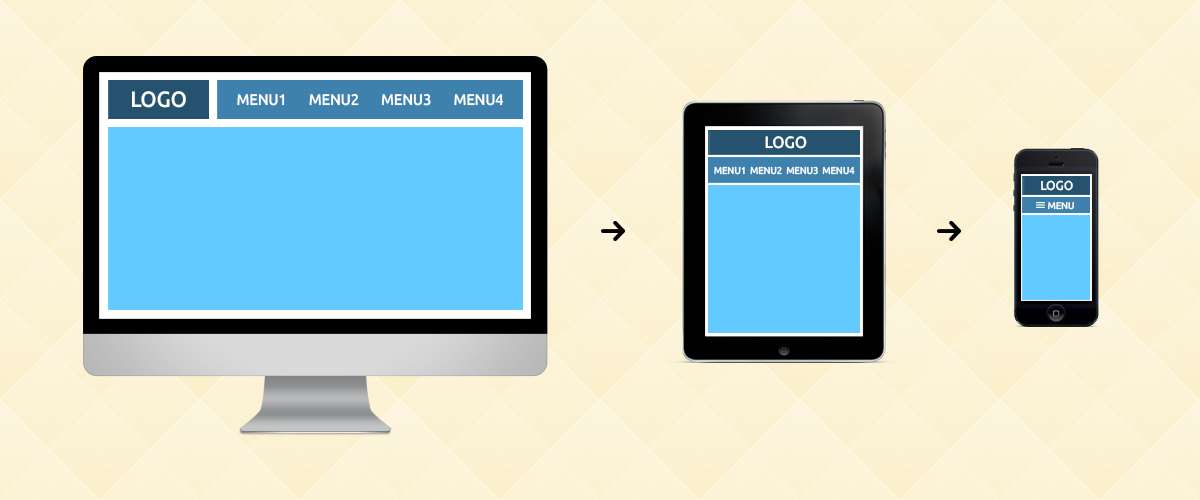
Make sure everything you have on your website is reflected in the mobile version too. In fact, most of the website navigation menu will be displayed within the hamburger menu on a mobile phone.


E-commerce website navigation design best practices
We can say that navigation is one of the most critical parts of e-commerce website design. Good navigation provides a better user experience, resulting in more sales and revenue. Here are some tips for you to make a better user experience.
E-commerce websites are generally targeted to customers who have a clear willingness or impulse to buy. Color is a great motivator and using bright colors can increase a consumer's desire to purchase.
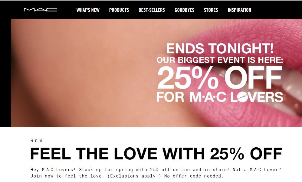
Secondly, an e-commerce website navigation bar should be designed based on the user's needs. You can add some promotional info, such as “20% off”, “Ends tonight”, etc., to increase a consumer’s impulsive to purchase from the website.

Last but not least, the navigation bar of an e-commerce website needs to attract users to click.
Related article: Top 15 Best Free E-commerce Website Templates for 2018
8 best user experience website navigation examples
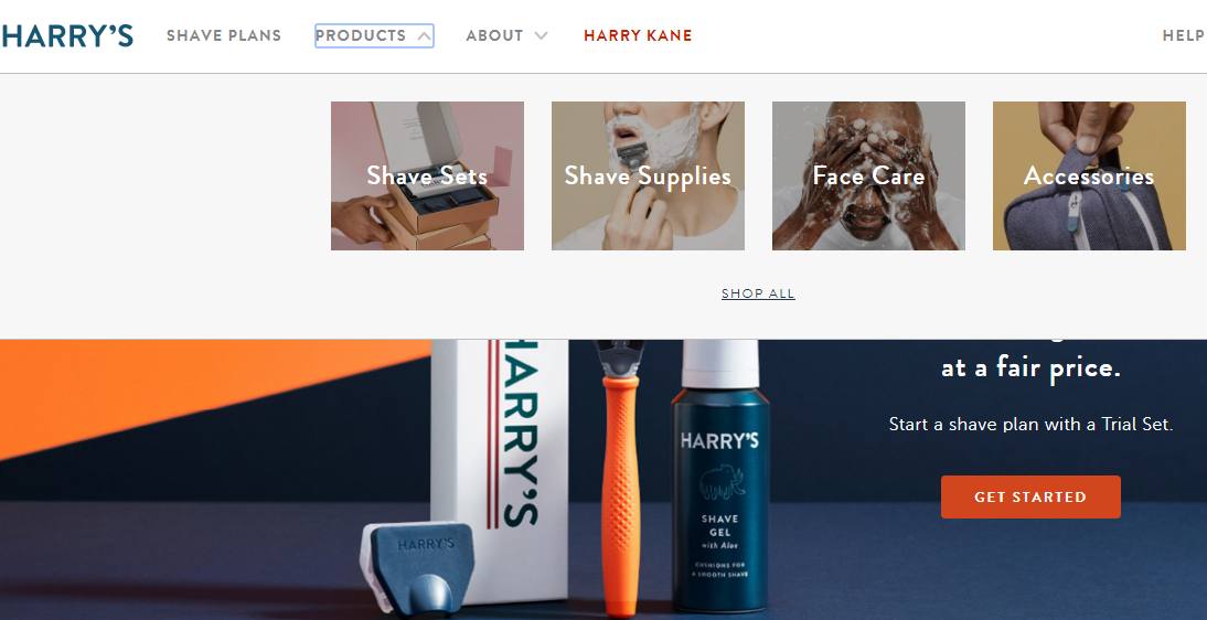
Harry’s is a men’s shaving skin care brand with a clear navigation bar. The product page uses a drop-down menu to show related products, and also comes with a picture display, which is intuitive and clearly shows what the product is.

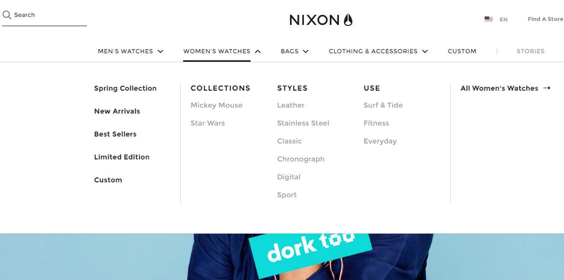
Nixon is a brand of watches and accessories. The primary navigation has 6 columns, each of which adopts the mega menu design method to display more products. And the best part is that has a search box that allows users to find products more quickly.

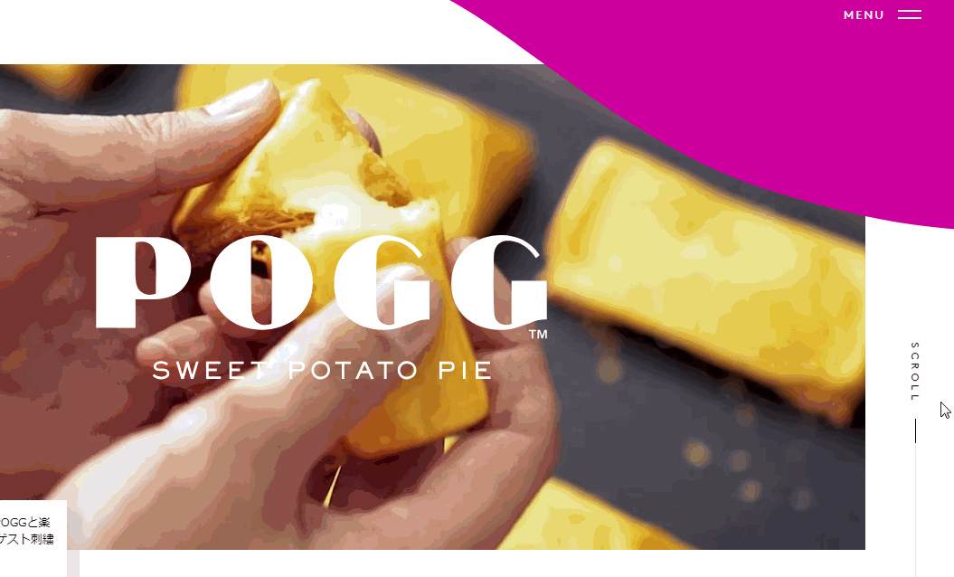
Pogg is a website selling potato pies. The website has a hamburger navigation menu, which can be accessed to gain more product-related info and save more screen space. The navigation bar's text and background color are very delicate.

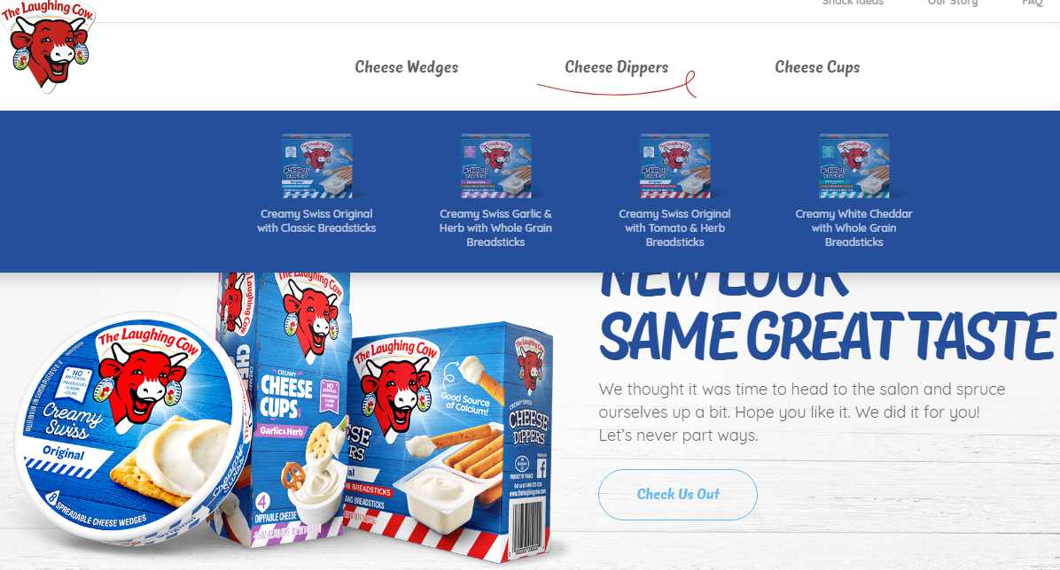
The laughing cow is a website selling cheese. Its design and style are very cute. The navigation bar of the website has only three columns. You can see more products in the drop-down menu. Each product has a description picture, and the style is consistent and beautiful. Most importantly, this website has a product locate function on the right side of the navigation, and you can directly locate products in your neighborhood.

MAC is a cosmetic brand that every girl knows. We can see a large amount of promotional information on the homepage. The navigation bar of the website also highlights the key points, such as "what’s new ", "best-sellers" and so on. Its clear navigation allows users to find the right product quickly, and there is also a search box on the right side, which can quickly locate specific products. You can also find more info on the bottom navigation.

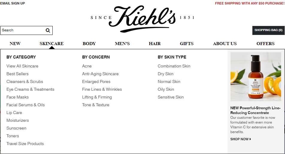
Kiehl's is a skin care brand. A mega menu can show more products.

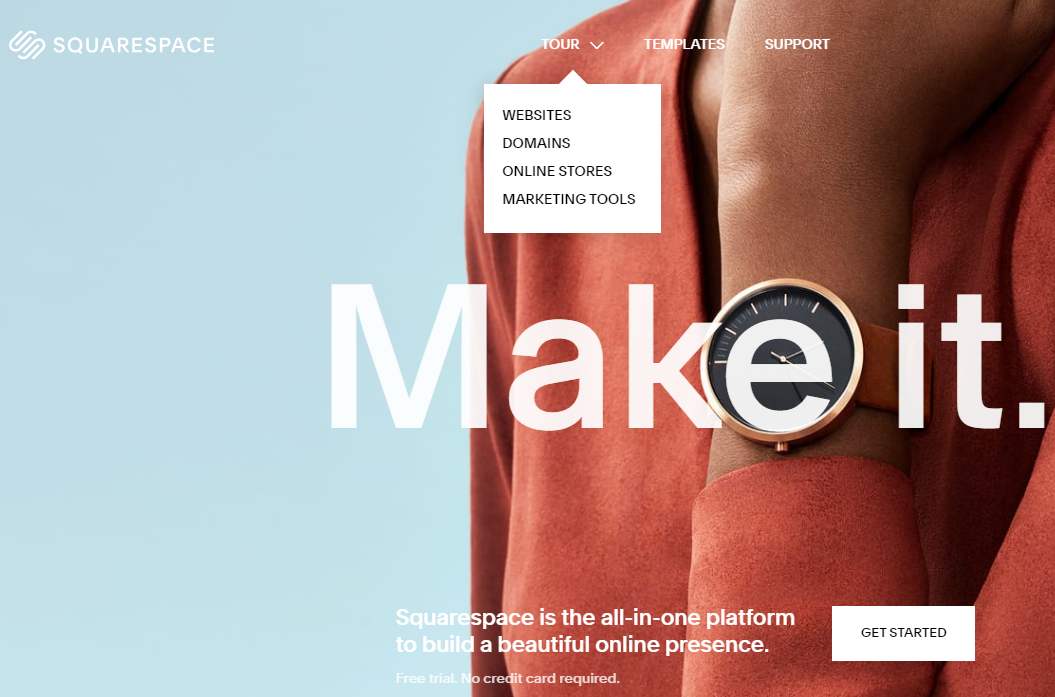
Squarespace offers a website builder service. The top website navigation has only 3 columns, which is very simple and clear. You can drop down to see more sub-items in the “Tour” section. More information can be found at the bottom navigation menu.

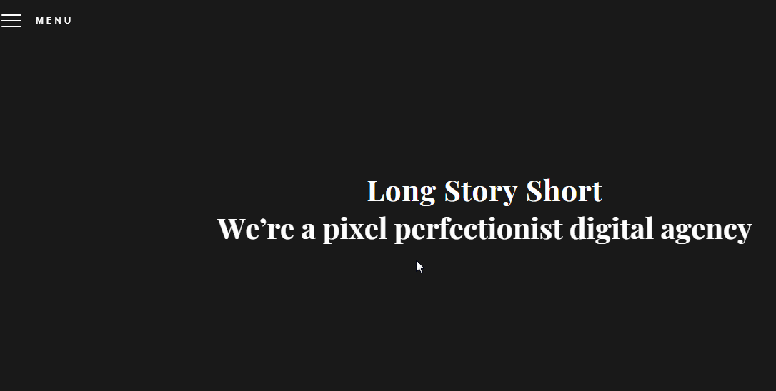
Long story short design is a website for digital and brand design services. The navigation bar of the website is a typical hamburger navigation menu.

Creative website navigation design examples


How to design a complicated navigation bar?
A large website usually has a lot of products and content. Dealing with a complicated navigation bar is not easy. Here is the best solution to this problem: How do I handle complex navigation for responsive designs?
In addition, a good prototyping tool can help you reduce your time and cost, as well as make your work more efficient.
3 best navigation bar design code resources
Https://codemyui.com/tag/navigation-menu/
Https://www.w3schools.com/css/css_navbar.asp
Https://medium.com/level-up-web/20-responsive-navi...
Conclusion
Navigation bar design must always meet the needs of the user and the website. It must be concise and consistent with the overall style of the website. In my opinion, a simple and clean website always provides the best user experience.
Free prototyping tool for web and mobile app design
Get Started for Free
Free prototyping tool for web and mobile app design
Get Started for Free
Free prototyping tool for web and mobile app design
Get Started for Free


